Menu
Work
About
Contact
pop oral beauty
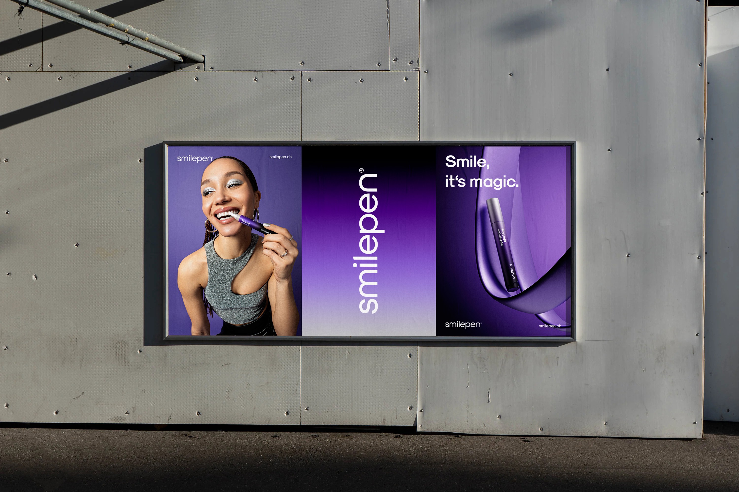
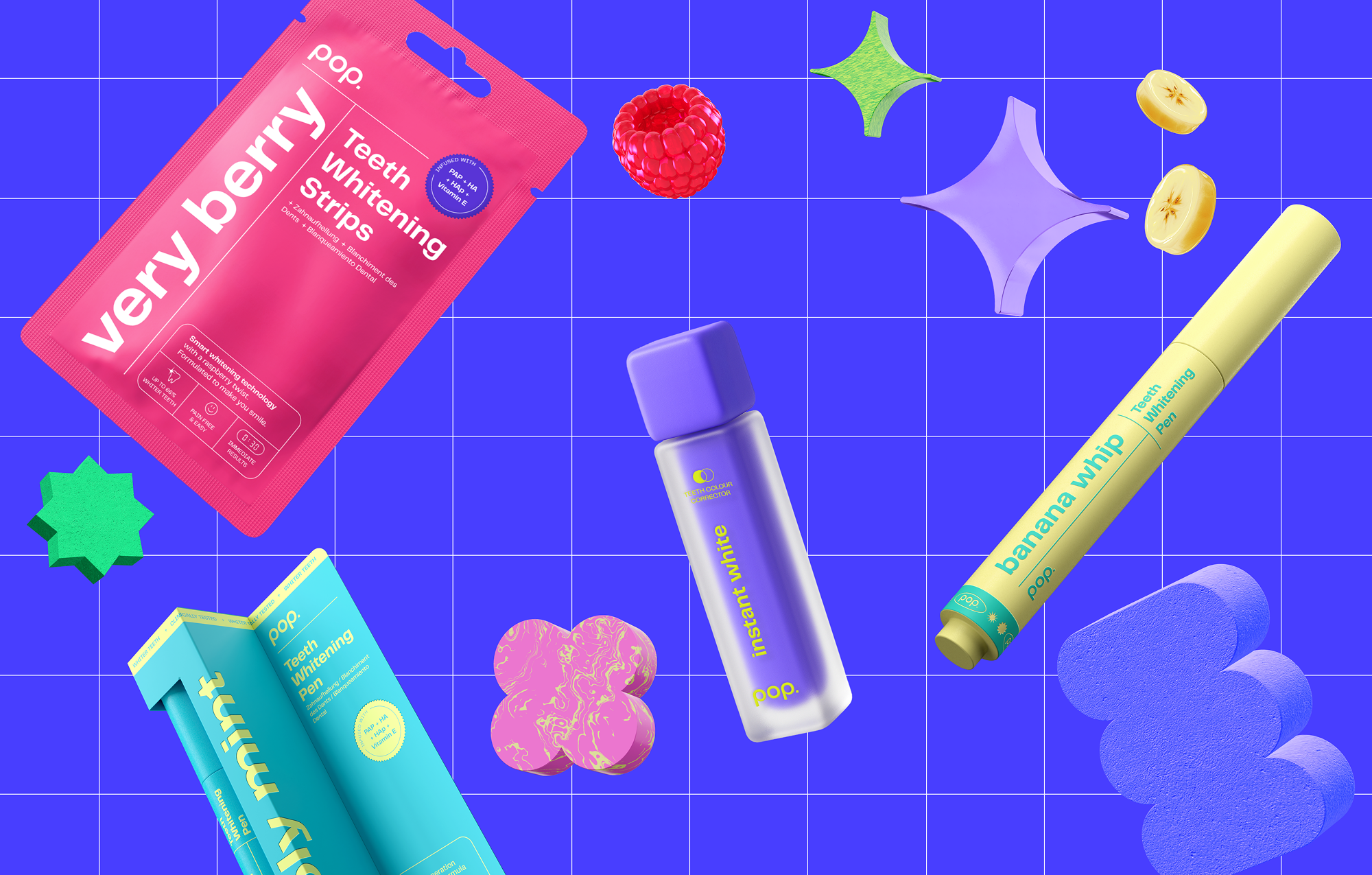
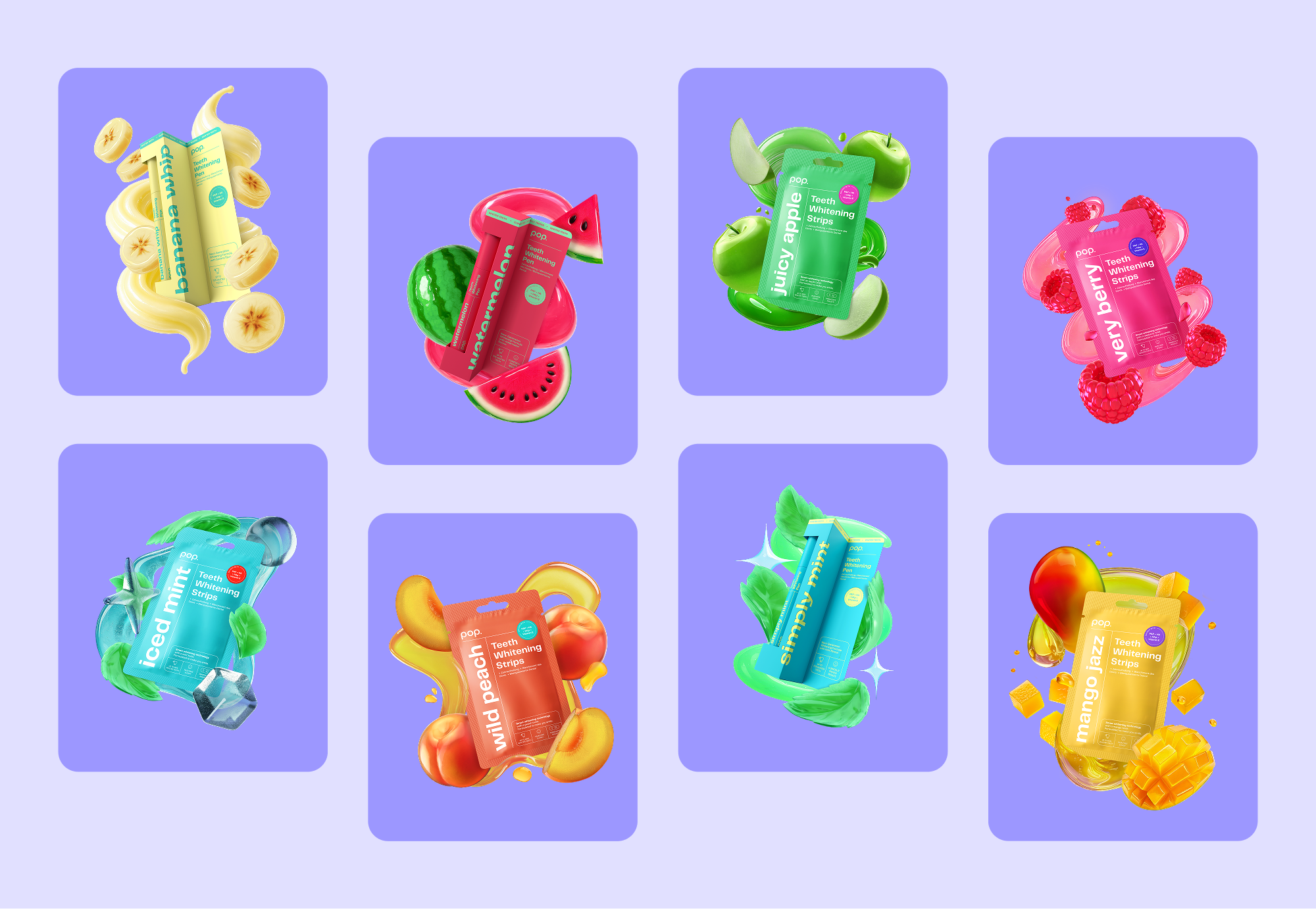
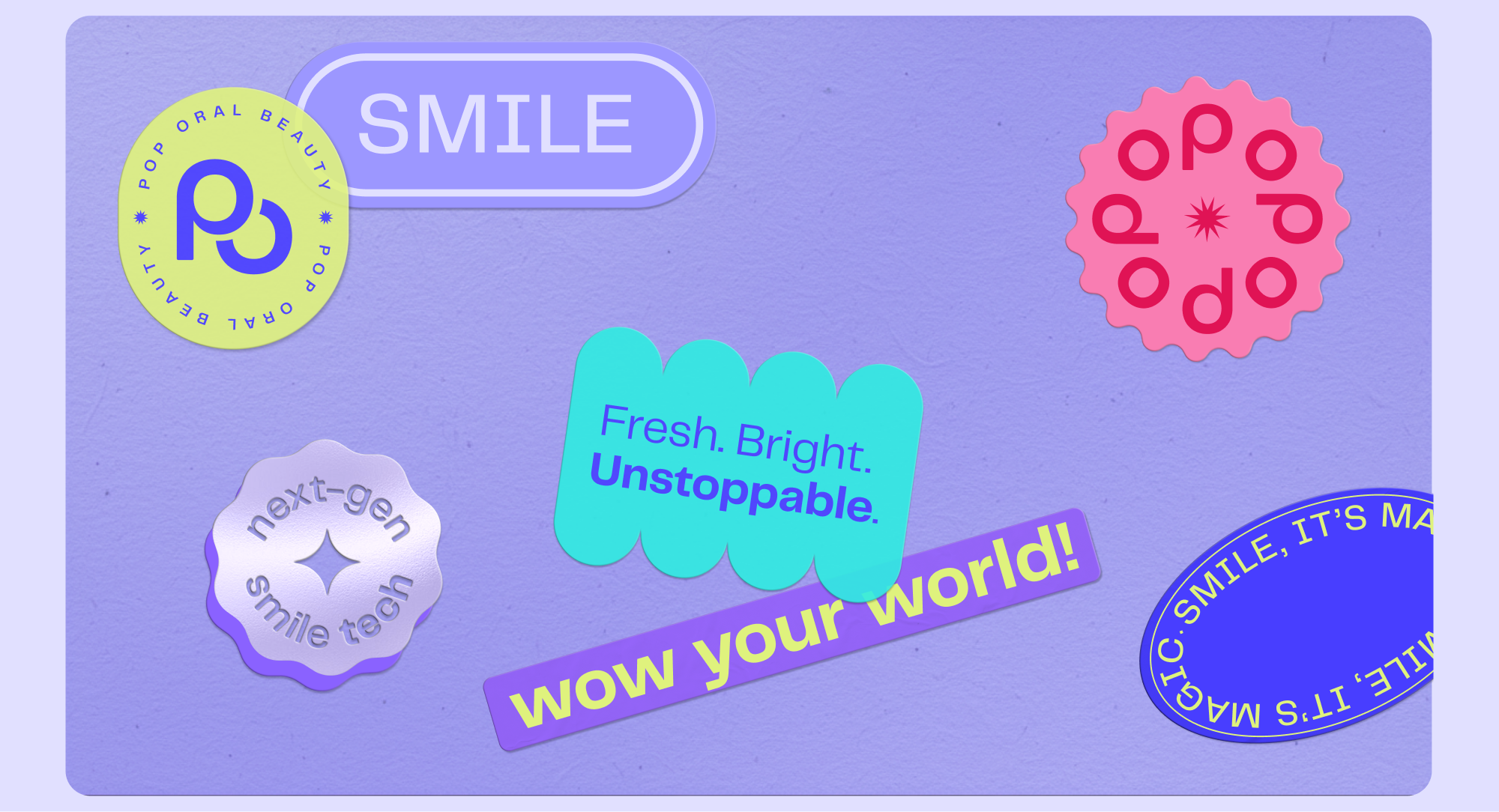
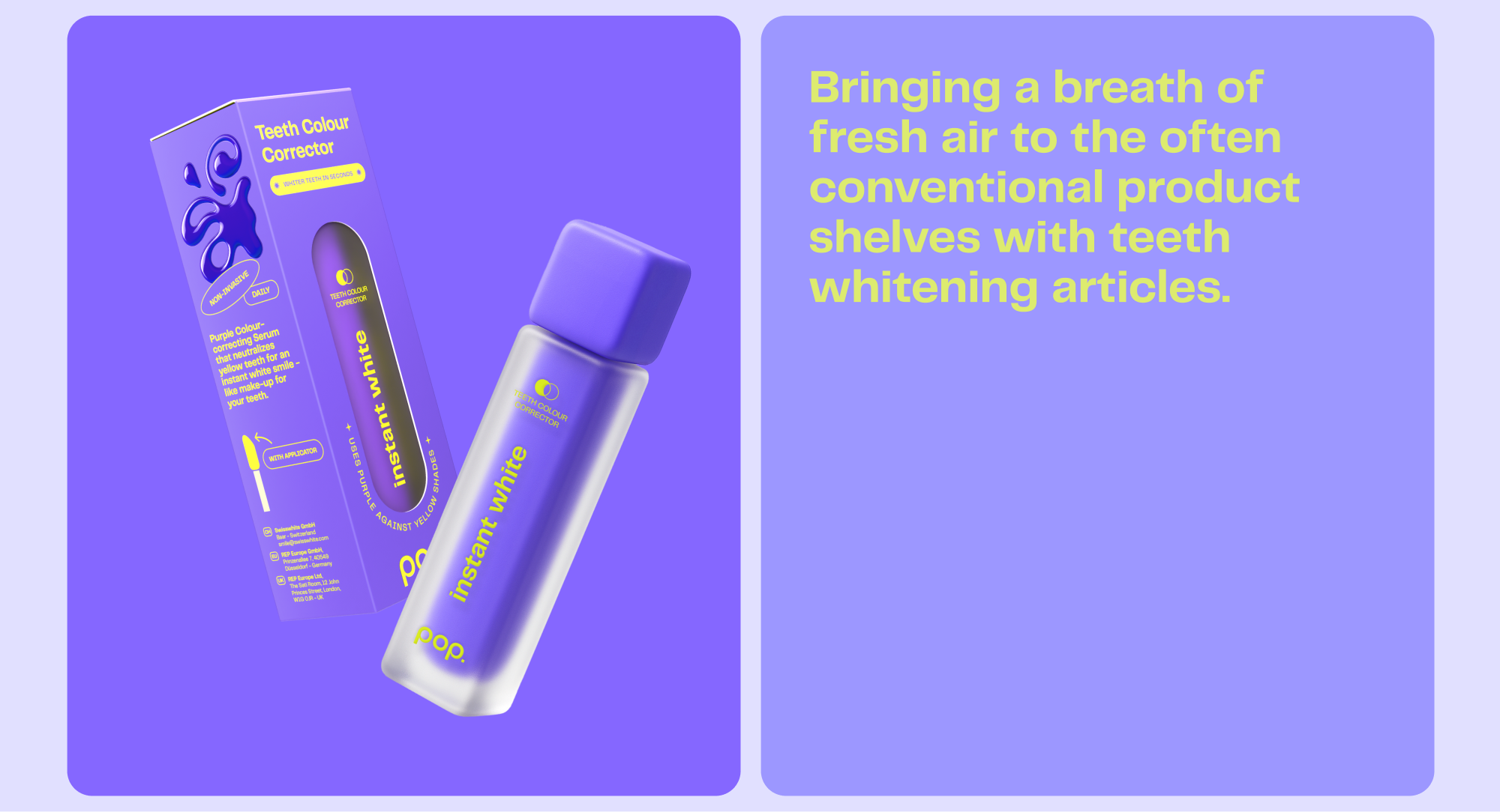
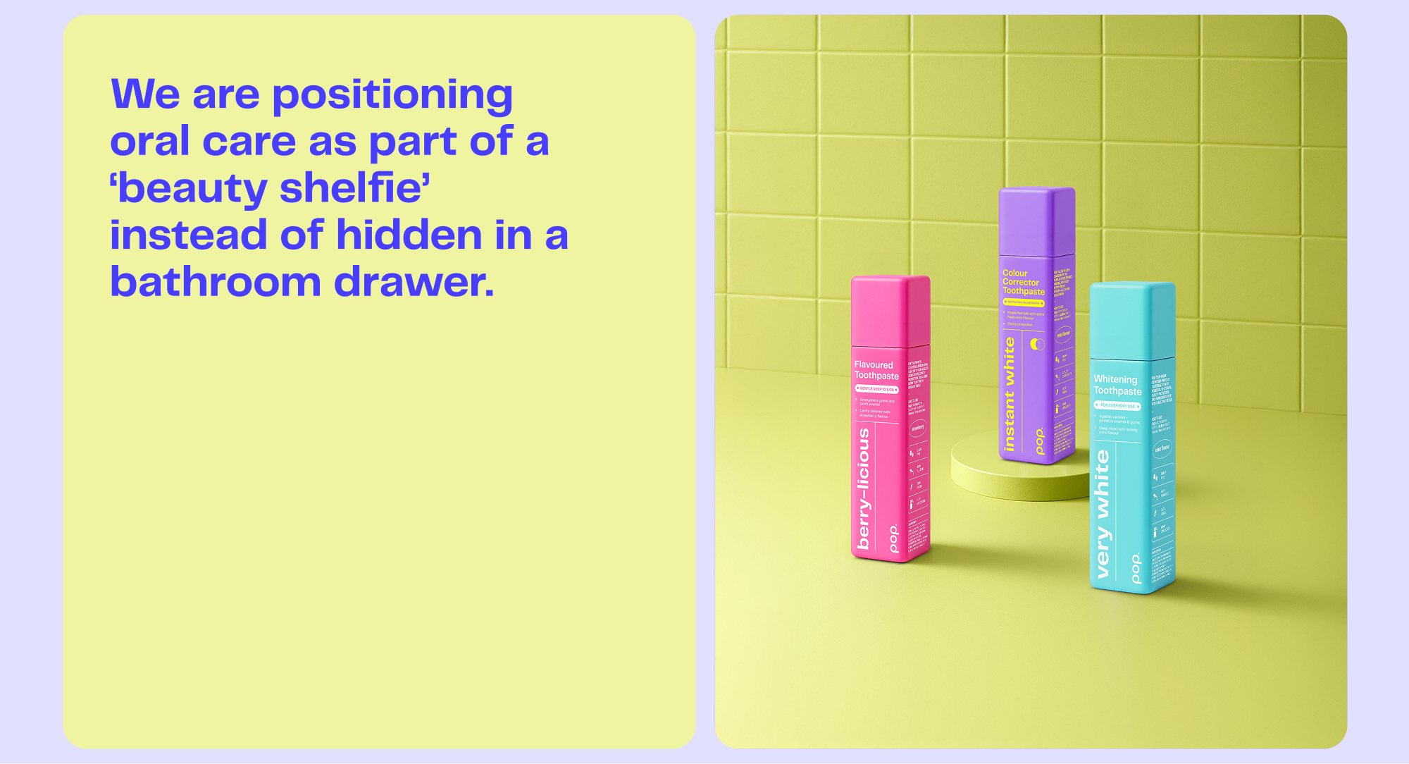
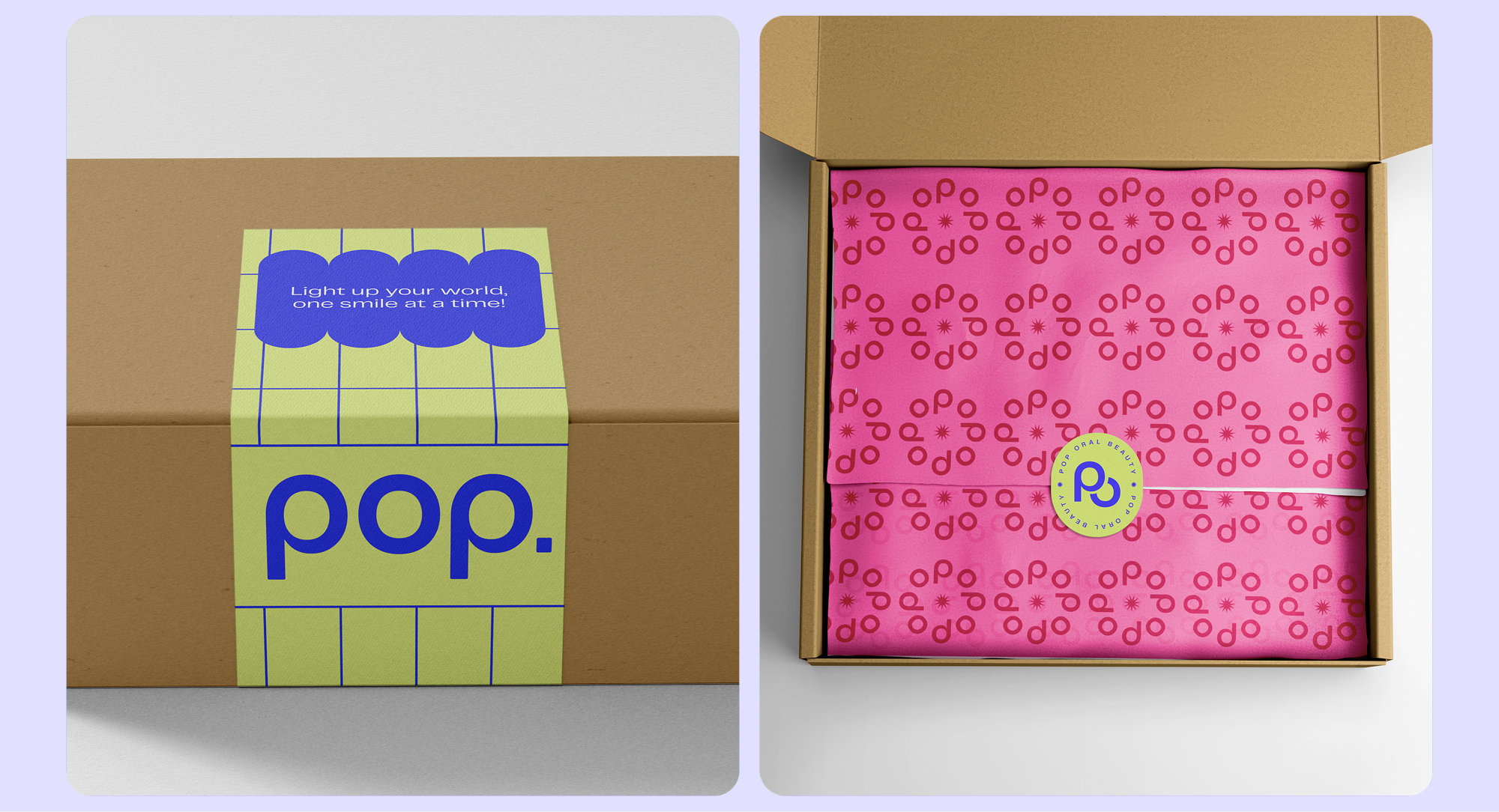
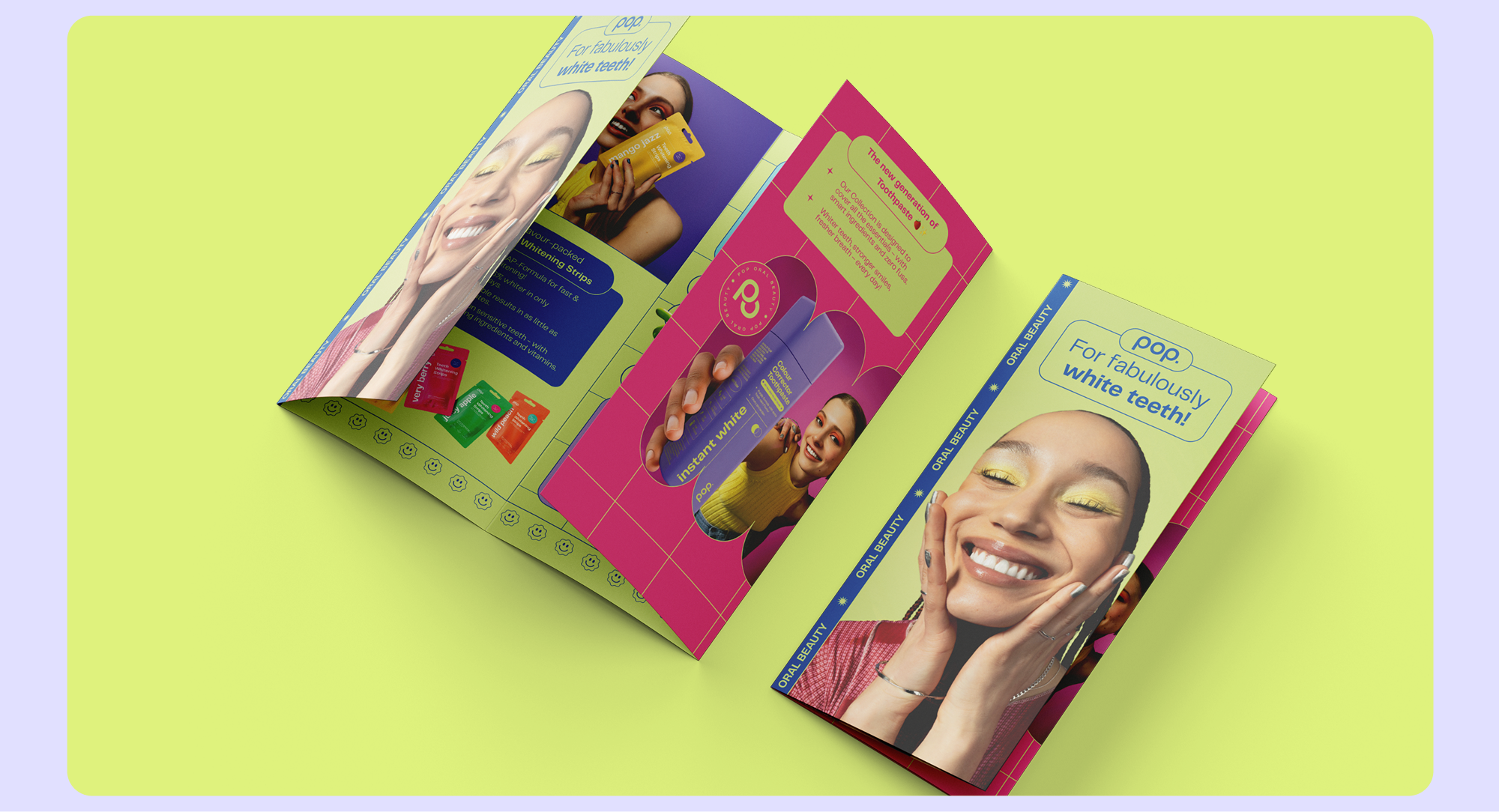
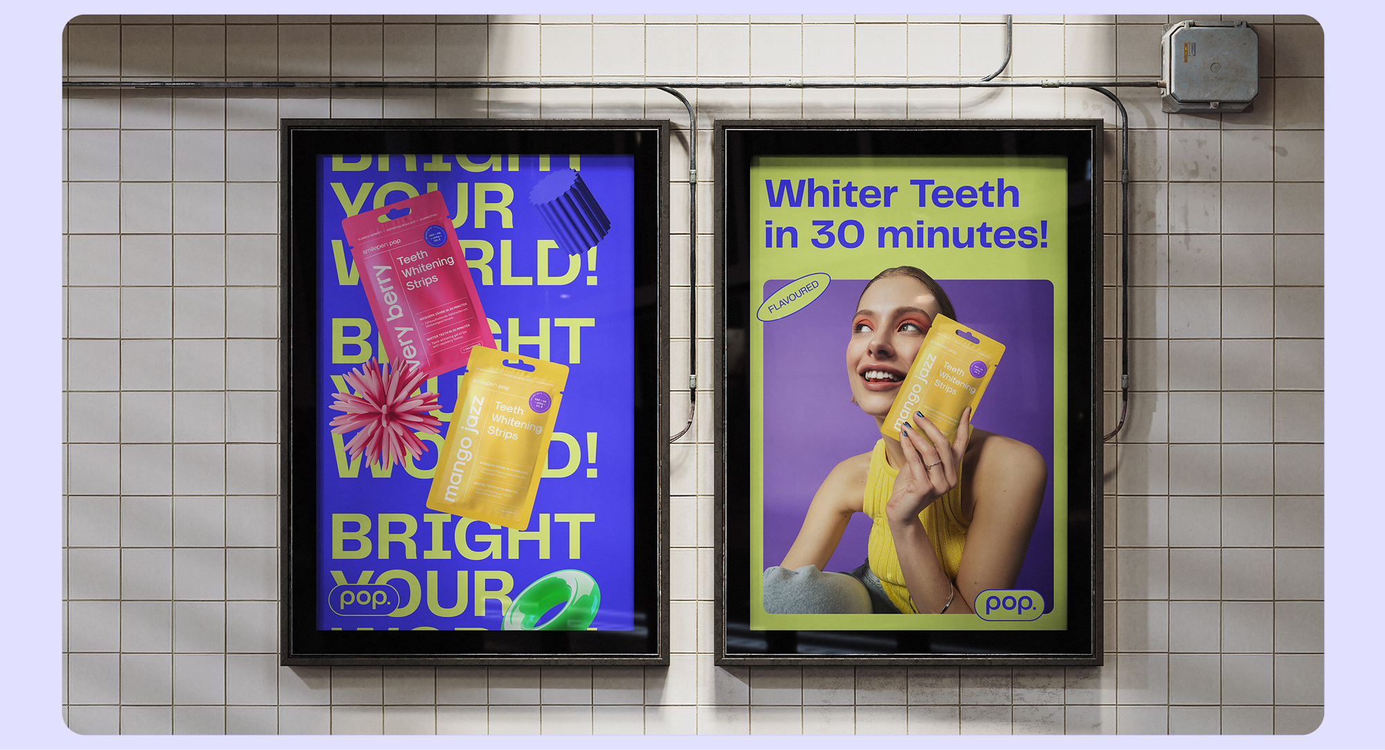
After success with their professional teeth whitening line smilepen, International Brands saw the opportunity to enter the market with a more affordable, playful brand: pop. Using a design language inspired by colours, starlike shapes and stickers, and a modern grotesque typography system, the identity was rolled out across multiple platforms while maintaining maximum consistency. On launch, the new brand was welcomed with enthusiasm by multiple retailers and distributers. Sales were boosted and the team was able to gain dozens of new accounts, including an expansion into the Australia and Canada.
CREATIVE DIRECTION, WEB DESIGN, PACKAGING AND PHOTOGRAPHY:
EVA LANKHORST
RENDERIST
RALPH SHANZES
BRAND AND PACKAGING DESIGNER:
MATLIS CENUKA
BRAND STRATEGIST:
MELANIE GIESINGER
WEB DEVELOPMENT:
CRAFTBERRY




Connect with me to explore your project's potential.
Projects
pop oral beauty
After success with their professional teeth whitening line smilepen, International Brands saw the opportunity to enter the market with a more affordable, playful brand: pop. Using a design language inspired by colours, starlike shapes and stickers, and a modern grotesque typography system, the identity was rolled out across multiple platforms while maintaining maximum consistency. On launch, the new brand was welcomed with enthusiasm by multiple retailers and distributers. Sales were boosted and the team was able to gain dozens of new accounts, including an expansion into Canada, South-Africa and the Middle East.
CREATIVE DIRECTION, WEB DESIGN, PACKAGING AND PHOTOGRAPHY:
EVA LANKHORST
RENDERIST
RALPH SHANZES
BRAND AND PACKAGING DESIGNER:
MATLIS CENUKA
BRAND STRATEGIST:
MELANIE GIESINGER
WEB DEVELOPMENT:
CRAFTBERRY


Connect with me to explore your project's potential.
Projects
pop oral beauty
After success with their professional teeth whitening line smilepen, International Brands saw the opportunity to enter the market with a more affordable, playful brand: pop. Using a design language inspired by colours, starlike shapes and stickers, and a modern grotesque typography system, the identity was rolled out across multiple platforms while maintaining maximum consistency. On launch, the new brand was welcomed with enthusiasm by multiple retailers and distributers. Sales were boosted and the team was able to gain dozens of new accounts, including an expansion into the Australia and Canada.
CREATIVE DIRECTION, WEB DESIGN, PACKAGING AND PHOTOGRAPHY:
EVA LANKHORST
RENDERIST
RALPH SHANZES
BRAND AND PACKAGING DESIGNER:
MATLIS CENUKA
BRAND STRATEGIST:
MELANIE GIESINGER
WEB DEVELOPMENT:
CRAFTBERRY


Connect with me to explore your project's potential.
Projects
